


De Stijl: The White Stripes
This doesn't happen very often, but here is some music for our art week.
I’m going to assume that most readers are familiar with The White Stripes, and may even know that they have an album entitled De Stijl. This post is only tangentially about it, but more about how the White Stripes as a band actually actively embraced the principles of the movement as they made their music. Love them or hate them, they are a very good example of the principles of the movement.
We can start with the name of the band itself, which is in alignment with the principles of the movement - primary colors and modes, and straight lines. Second, a cursory glance at their album covers reinforces this. De Stijl is pretty blatant in what it is doing:
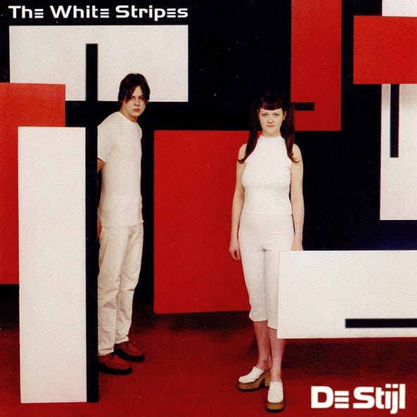
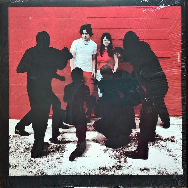
The only surprise here is that Theo van Doesburg’s font is not used for the album name. More subtle is White Blood Cells, which emphasizes negative space and the contrast in texture between the bricks to the right and left of the band.
Of course, that’s just the visuals. The De Stijl-inspired constraint of the band comes out of their structure. A simple drum kit, and an electric guitar. Two people, two simple instruments. And it is from within this constraint that the band operates, and creates a surprisingly diverse range of music.
So have a listen to De Stijl while you ponder the work of Mondrian and van Doesburg. We can’t promise that they will go well together, but they are similarly composed.
Postscript: One of us has a dissenting opinion regarding the above. It’s not a diagonal-lines-are-the-devil’s-work kind of dissent, but … then again, if you start seeing “de-classified” in your inboxes, remember this day.