


De Stijl: Theo van Doesburg
A true believer in the transformative power of art, Theo van Doesburg never lost faith in the movement, even if he lost it in the movement's co-founder.
One of the founding members of the De Stijl movement, Theo van Doesburg whole-heartedly believed that art was more than just a visual experience – it was part of an encompassing spatial and physical environment in which painting, architecture and design were completely integrated. But this wasn’t just about aesthetics — he truly thought of abstraction as an spiritual exercise, and believed De Stijl’s reductive nature was ultimately a means for achieving universal harmony.
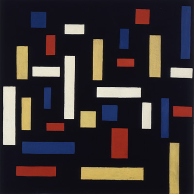
(Theo van Doesburg, “Composition VII” - 1917. Photo: WikiCommons.)
He and Mondrian started the De Stijl publication in 1919, at which point painting really took a back seat, until about 1924 (more on that later). Instead, he spent most of his time pretty much proselytizing via lecterns and publications. And he collaborated. A lot. (Maybe it was a sign that he was a true believer in the universal nature of De Stijl, or maybe he was like me and just into a bunch of different stuff.)
He undertook several stained glass projects in collaboration with J.J. Oud, including a house that Oud was building in 1918, and apartment buildings in Rotterdam. It wasn’t a collaboration that lasted very long, mostly because the two couldn’t quite agree about how to balance architectural elements with art and other every day items. (Van Doesburg and Oud weren’t the only two to have this problem – it ended up being a recurring issue between the artists and architects in movement.)

(Theo van Doesburg, Stained Glass Composition - 1917. Photo: moma.com.)
Van Doesburg even dabbled in typography, designing an austere, geometric alphabet style that thrived for a few years. Not surprisingly, it was rooted in math and geometry, with every character based upon a square dividing into a raster of 5x5. As a lover of fonts – particularly sans-serif ones – I mostly like it.
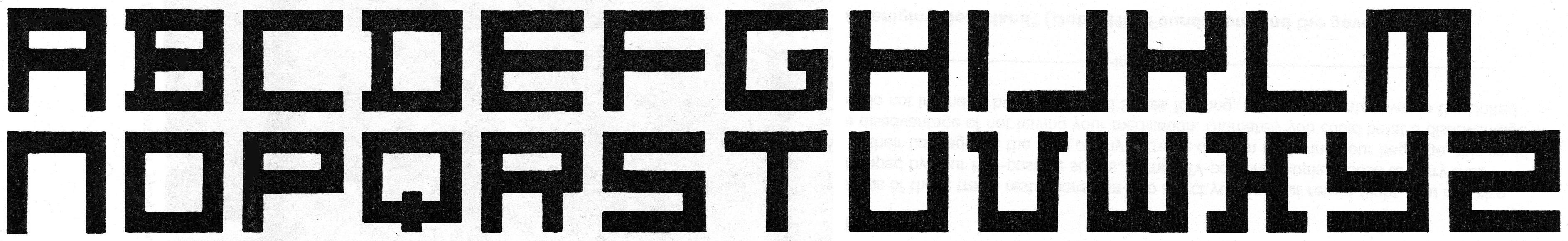
(Architype Van Doesburg - 1919.)
There’s a distinct symmetry to it (the J and L are mirror images; the U is just an upside-down N) – even though when viewed against more modern sans-serif styles, it’s perhaps a bit clunky, and there are definitely some awkward characters (especially the K and X). Its usage was greatly varied, ranging from a collaboration on a series of children’s books to the logo for the League of Revolutionary-Socialist Intellectuals. (Oh, the 1920s, when of course such worlds collided.)
Later, in various collaborations with architects, he tried to translate two dimensions into three, bringing the elements of his earlier paintings to life, from canvas to structure. One of the best examples of this effort was the design for the “Maison Particuliere.” Like much of his work, to me there’s a tension here — a sort of push-and-pull between theory and form, which is perhaps inevitable when you try to find harmony through a rigid reduction. (We’ll talk more about De Stijl architecture later this week, so I won’t delve into it here.)

(Theo van Doesburg and Cornelis van Eesteren, “Maison Particuliere” - 1923. Photo: WikiCommons.)
Maybe as a result of his various attempts to bring it to practical/3D life, van Doesburg increasingly felt like De Stijl as originally conceived was ultimately too rigid. His expanded view of the style made room not only for diagonal lines (infamous for causing the 1924 rift with Mondrian), and triangles, but graduated tones of primary colors and shades of gray. It was during this period that he returned to painting, creating what I think are his best works.
I’m not sure whether van Doesburg’s later Elementarism works were a direct rebuttal to Mondrian’s Neoplasticism, but they sure feel like a big fat period at the end of the last thing he said during their last argument:
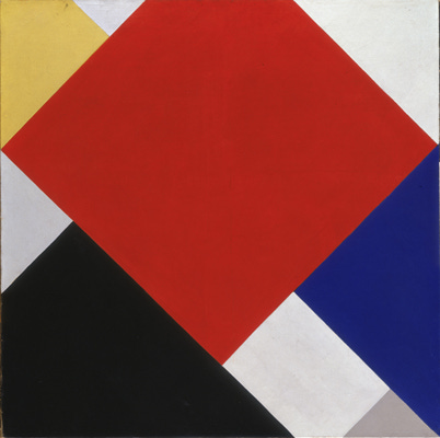
(Theo van Doesburg, “Counter-Composition V” - 1924. Photo: WikiArt.)
Here, von Doesburg basically took Mondrian’s squares and turned them on their ear (i.e. “counter” clockwise). Just this small change really gives the piece more movement, more energy, more life. There are also no distinct lines, and no space between the shapes (each key aspects of Mondrian’s style), which gives it a boldness and harmony. The overlapping shapes and color blocking also give it almost a depth of field - another basic no-no for Mondrian.
With von Doesburg’s evolved views at the core of these later works, for me, it’s as though cold, impersonal theory starts to give way to a richer, more harmonious human reality. In that way, I might argue that he surpassed Mondrian as a painter, even if Mondrian is still the more well-known De Stijl poster boy (I confess, before we started this week’s category, Mondrian was the only one I knew by name).
Beyond these later paintings, van Doesburg continued to extol the virtues of his brand of De Stijl, both in print and in practice, until his death in 1931.
It’s hard to pinpoint his specific, personal impact on future movements and styles, because he never really sought to establish an identity distinct from the movement. But if we consider them one and the same, then the ripples can still be seen in abstract art, architecture - even graphic design - today.